Member-only story
Determining screen types for Adaptive UI in Compose/Kotlin Multiplatform (Desktop and Android)
If we would be developing UI on Compose Multiplatform for mobile phones only, layouts for iOS and Android fairly similar if not an exact copy. Most apps have some kind of bottombar that takes care of navigating between different content that is displayed above the bottom bar.
When developing for other platforms like desktop/web, or even if we add tablet layouts for iOS/Android we need to develop different UI layouts depending on the screen dimensions.
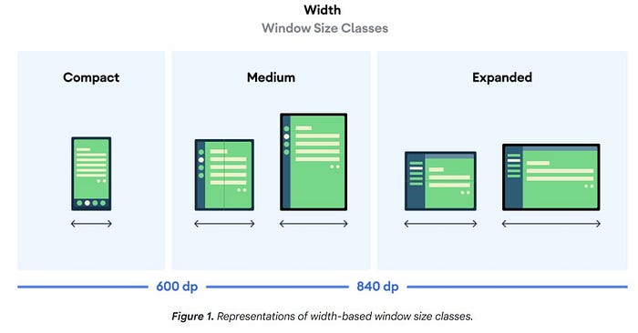
In the Material 3 Design system one approach to translate the standard bottom bar layout from mobile to larger screen sizes would be to first of all categorize its screensize to one of three possible types:
- Compact for screen sizes up to 600dp
- Medium for screen sizes between 600dp — 840dp
- Expanded for screen sizes larger than 840dp
Depending on the type we’d either display a bottom bar (Compact screen sizes), a navigation rail (Medium screen sizes) or an (always expanded) navigation drawer (Expanded screen sizes).

As the Material 3 guidelines show you could even add more categories for even larger screen sizes (laptop and desktop devices f.e.) and expand your strategy to what layout to show by also taking screen heights into account.
If you’d wish to read up on the layout guidelines you can check out the Material3 website or the Android Developers docs.
How to implement an Adaptive UI depending on the window size classification?
Basically there are 3 steps we need to fulfill:
1. Retrieve screen sizes information (from a Composable context)
For Android (for KMP see below) this could look something like as follows:
2. Depending on the the retrieved screen dimensions we determine what UI type to display…
